
Project overview
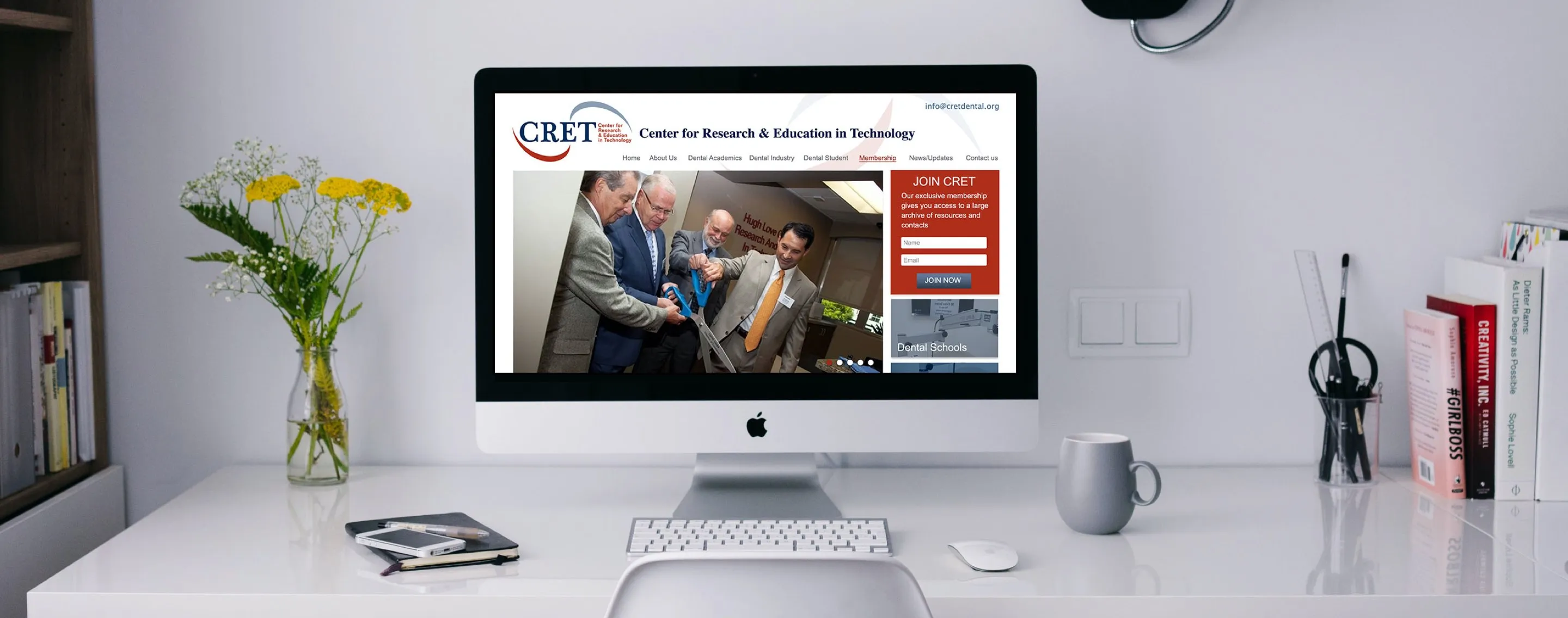
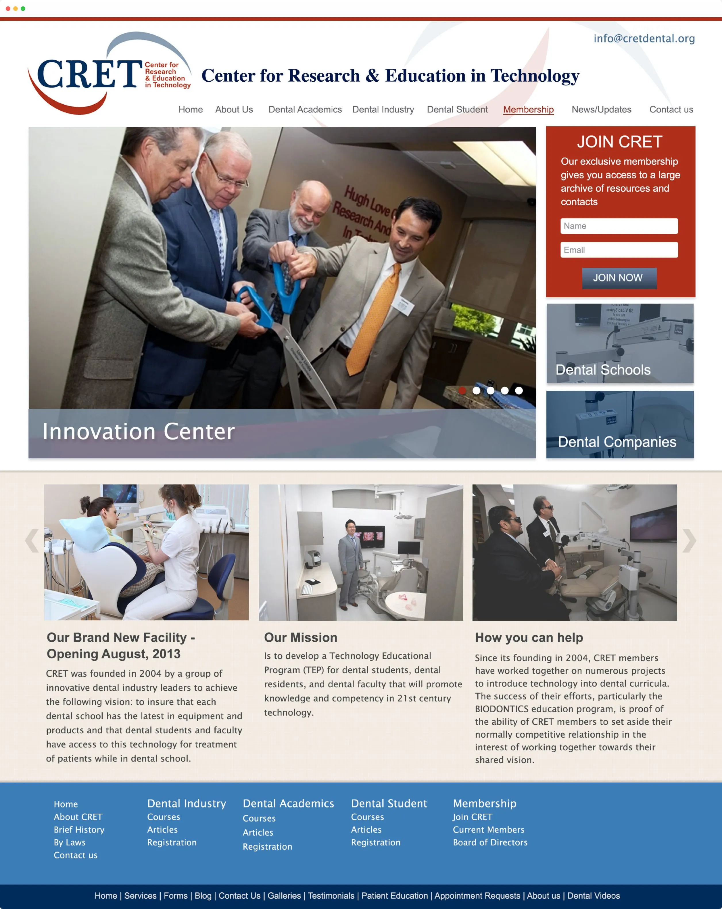
The Center for Research & Education in Technology (CRET) is a nonprofit organization that supports dental schools in integrating emerging technology into their curricula. Their role sits at the intersection of dental education and innovation, helping institutions stay aligned with evolving tools and clinical practices.
Their website had been in use for over a decade. While it remained functional, it no longer reflected how CRET operated day to day or how members engaged with updates, resources, and announcements. Over time, content management had also become increasingly inefficient.
CRET partnered with FAMGO to redesign the website with two priorities:
Challenge
CRET’s brand identity was already well established within the dental education community. The logo, colours, and visual identity were widely recognised by member institutions.
The challenge was not a rebrand. It was a structural redesign.
The existing website created friction in three key areas:
The goal was to rebuild the system so the team could publish and update content quickly without relying on external support.
Web design
UX design
Dental education / nonprofit

Rather than redesigning the visual identity, we retained CRET’s existing logo and colour system. This ensured continuity for returning users and preserved recognition within the academic and clinical community.
The focus shifted to improving structure and usability rather than changing how CRET looked.
CRET publishes ongoing updates related to dental technology and curriculum development. The previous site made this process slow and overly technical.
To solve this, we restructured the homepage around dynamic content placement, including a hero section designed to surface current announcements and updates.
This reduced dependency on page-level edits and allowed new content to be published more consistently.
With CRET serving both institutional partners and individual members, the existing website had developed a structural problem over time: it tried to serve multiple audiences using a single, flat navigation system. As the content library grew, this created overlap between pages, unclear entry points, and a heavy reliance on users already knowing where to go.
Our work began by mapping how different user groups actually interacted with the site. Instead of organising content based on internal departments or legacy page structure, we reorganised it around user intent and frequency of access.
We identified three primary user behaviours:
Each of these required a different navigation path, rather than competing for space within the same menu structure.
To support this, we rebuilt the information architecture with a clearer separation between:
This restructuring reduced cognitive load by removing duplicated pathways and consolidating related content under clearer categories. Instead of forcing users to interpret terminology or navigate based on institutional logic, the structure now reflects how users think about their tasks.
From a UX perspective, we also reduced the number of decision points required to reach high-value content. Key pages that previously required multiple clicks were surfaced earlier in the navigation hierarchy, while secondary content was grouped into contextual sub-sections rather than standalone top-level pages.
The result is a more predictable navigation experience where users can reliably locate updates, resources, and organizational information without needing prior familiarity with the site structure.
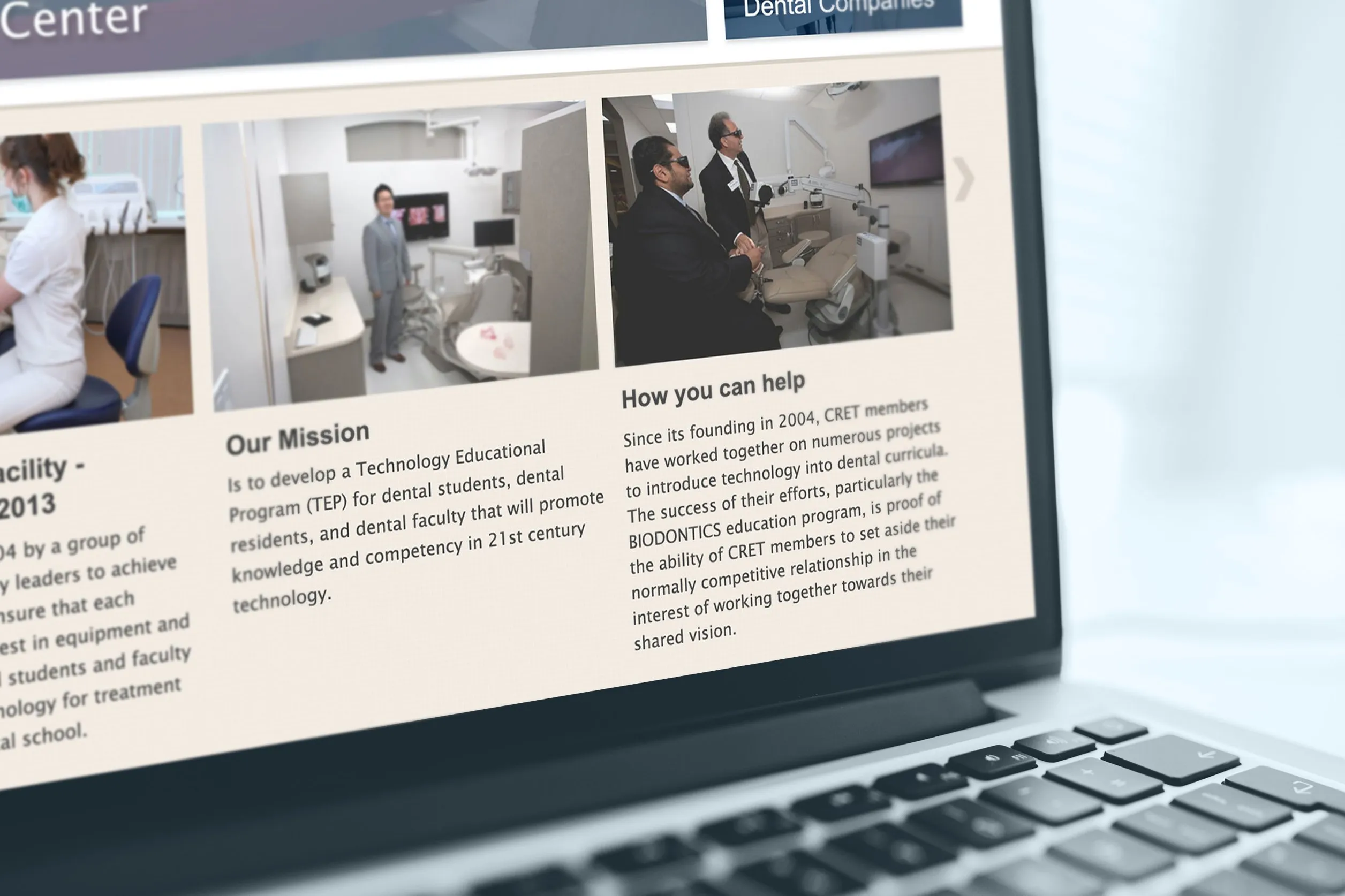
One of the main challenges with CRET’s original website was not the lack of content, but the lack of content hierarchy and lifecycle management. Over a decade, the site accumulated announcements, resources, and informational pages without a consistent system for prioritisation or deprecation.
This led to a common issue: important updates were visually present on the site, but functionally difficult to find.
Our content strategy focused on restructuring how information is prioritised, surfaced, and maintained over time.
We introduced a clearer distinction between three content types:
Each category was treated differently in both structure and presentation.
Evergreen content was stabilised into fixed pages with minimal change frequency, ensuring consistency for new visitors and search engines.
Dynamic content was redesigned to be more visible and time-relevant, with homepage placement prioritised over deep navigation. This ensures that new updates are immediately visible without requiring users to actively search for them.
Resource content was reorganised to reduce duplication and improve scan-ability. Instead of fragmented pages spread across multiple sections, related materials were grouped into clearer thematic clusters.
We also considered the operational side of content management. The previous system required multiple steps for simple updates, which discouraged frequent publishing. The new structure reduces this friction by allowing content to be added in repeatable formats, making it easier for non-technical team members to maintain consistency over time.
Overall, the content strategy was not just about reorganising information, but about aligning the website with how frequently different types of content should realistically change.
CRET now has a website that aligns with its established identity while significantly improving day-to-day content management.
The new structure:
The site is built on a flexible Webflow structure designed to support ongoing updates without requiring developer intervention.
FAMGO Design is a web design agency based in Toronto, Canada. Our team specializes in high-performance custom web design focused on driving conversions, generating leads, and increasing website traffic.
Let's build a website that reflects how good your business actually is and brings in the right clients. Start with a free audit of your current site, and we will show you what is working, what is not, and where the biggest opportunities are.
Free website audit