Designing a dental website that helps families feel confident before they ever book an appointment

A paediatric dental website serves two audiences at the same time. Parents are evaluating trust, expertise, and clarity. Children are responding to tone, visuals, and emotional cues. A successful experience must support both without overwhelming either.
Star Walks Dental partnered with FAMGO Design to redesign their website with one goal: make it easier for families to understand the clinic, trust the team, and take the next step with confidence.
Instead of focusing on visual refresh alone, we approached the project as a complete digital experience redesign. The outcome is a custom Webflow website that combines strategic branding, UX design, UI design, conversion-focused structure, and SEO foundations into a scalable system the clinic can grow with.
Website strategy
Dental website design
Custom Webflow development
Responsive website development
SEO foundations
Accessibility best practices
Paediatric and family dentistry
Challenge
Create a website that reflects a child-friendly dental clinic while making it easier for parents to evaluate services and book appointments.
Solution
We redesigned the information architecture, brand expression, and user journey to reduce uncertainty and guide families toward booking with clarity and confidence.
Outcome
A scalable, conversion-focused website that improves clarity, strengthens brand trust, and gives the clinic full control over future updates.
“We wanted a website that felt as welcoming as our clinic. FAMGO helped us translate that feeling into a clear, easy-to-use experience for families.” Dr. Mann, Star Walks Dental

Most dental websites fail not because they lack design quality, but because they don’t reflect how families actually make decisions.
Star Walks Dental needed more than a visual refresh. They needed a digital experience that aligned with how parents evaluate healthcare providers in real life.
A paediatric dental website is unique because it serves two very different audiences simultaneously:
Parents are focused on:
Children respond to:
The challenge was creating a single experience that supports both without compromising either.
During initial analysis, we identified a common issue in many dental websites: trust is assumed rather than built.
Parents were expected to reach the “Book Appointment” stage without enough context to feel confident in their decision.
Key missing elements included:
This created friction in the decision-making process.
Another challenge was structure.
Like many healthcare websites, content was organized around internal services rather than user intent. This meant parents had to “navigate the clinic” instead of getting answers to their questions.
We saw opportunities to improve:
The goal was to reduce cognitive effort at every step.
While Star Walks Dental already had a strong identity, it was not fully translated into a cohesive digital experience.
The website needed to:
Ultimately, the website needed to answer one question as quickly as possible:
“Can I trust this clinic with my child?”
Every design and UX decision had to support that outcome.
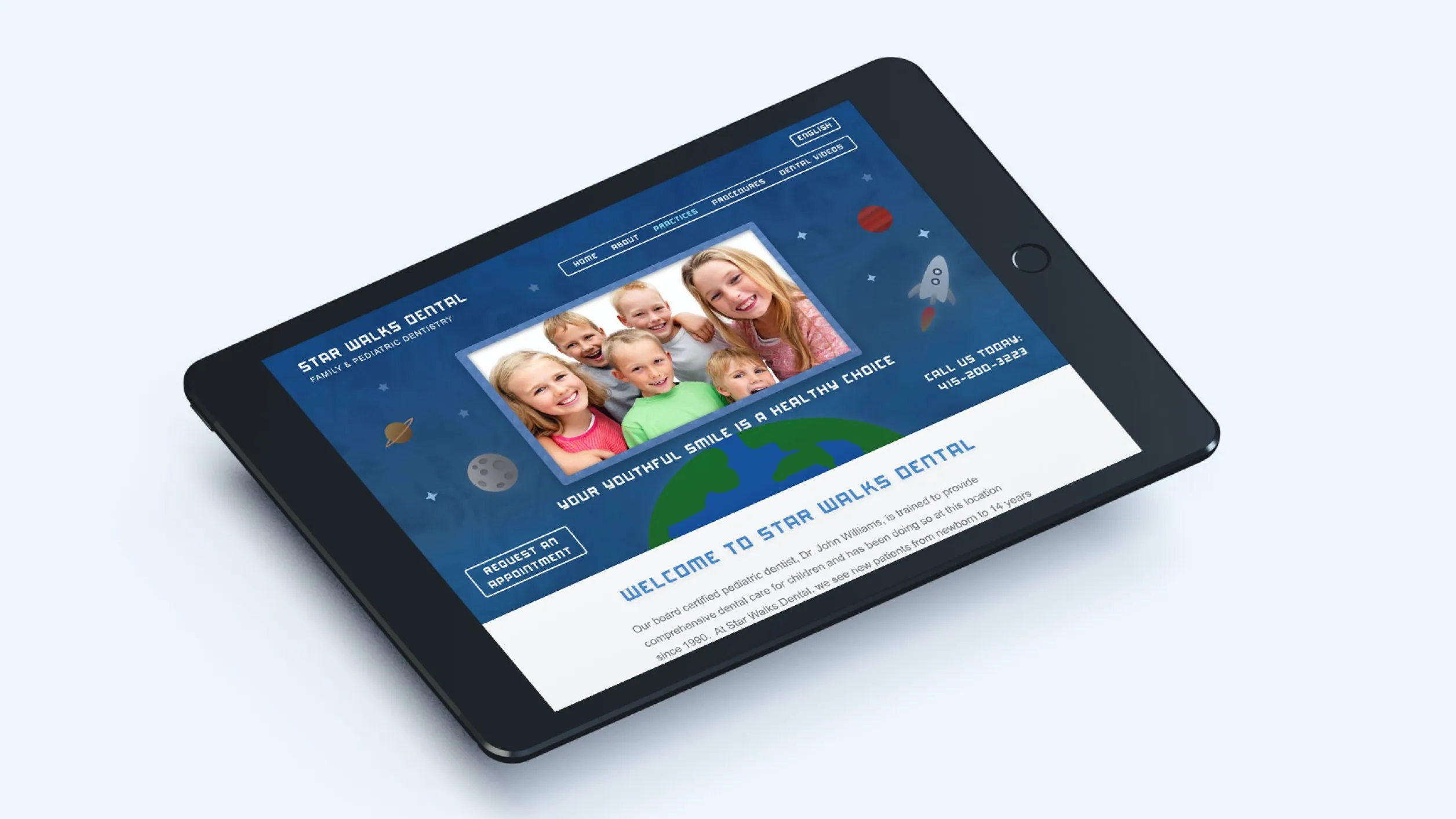
Before any design work began, we focused on understanding how families actually choose a paediatric dental clinic online. The goal was not to redesign pages, but to understand decision-making behaviour.
We found that parents rarely choose a dental clinic based on visuals alone. Their decision process is more cautious and structured than most industries.
They typically move through three mental stages:
1. Awareness
They discover a clinic through Google, referrals, or maps. At this stage, they are simply trying to understand whether the clinic is relevant to their child.
2. Evaluation
They compare clinics based on trust signals, clarity of services, reviews, and perceived expertise.
3. Confirmation
They validate their decision by looking for reassurance before booking.
The website needed to support all three stages, not just the final booking step.
We reviewed a range of paediatric and family dental websites to identify patterns in structure, messaging, and user experience.
Three consistent issues appeared:
Most websites made it easy to learn what the clinic offers, but not why it should be trusted.
This created an opportunity to rethink how information is presented.
The key insight from our research was simple:
Parents don’t need more information. They need clearer information in the right order.
Instead of front-loading services, we needed to structure the experience around trust first, clarity second, and action last.
This insight shaped the entire website architecture.
From the research phase, we established three guiding principles:
Every page needed to answer key questions before introducing calls to action. This ensures parents feel informed rather than pressured.
We reorganized the site to reflect how parents think, not how clinics are structured internally.
The design needed to feel warm enough for children, but credible enough for parents making healthcare decisions.
These principles directly influenced how the website was built:
The strategy phase ensured that design decisions were not subjective, but grounded in how real users evaluate healthcare providers.
Effective healthcare websites are not built around what a clinic wants to say. They are built around what families need to understand before they can make a confident decision.
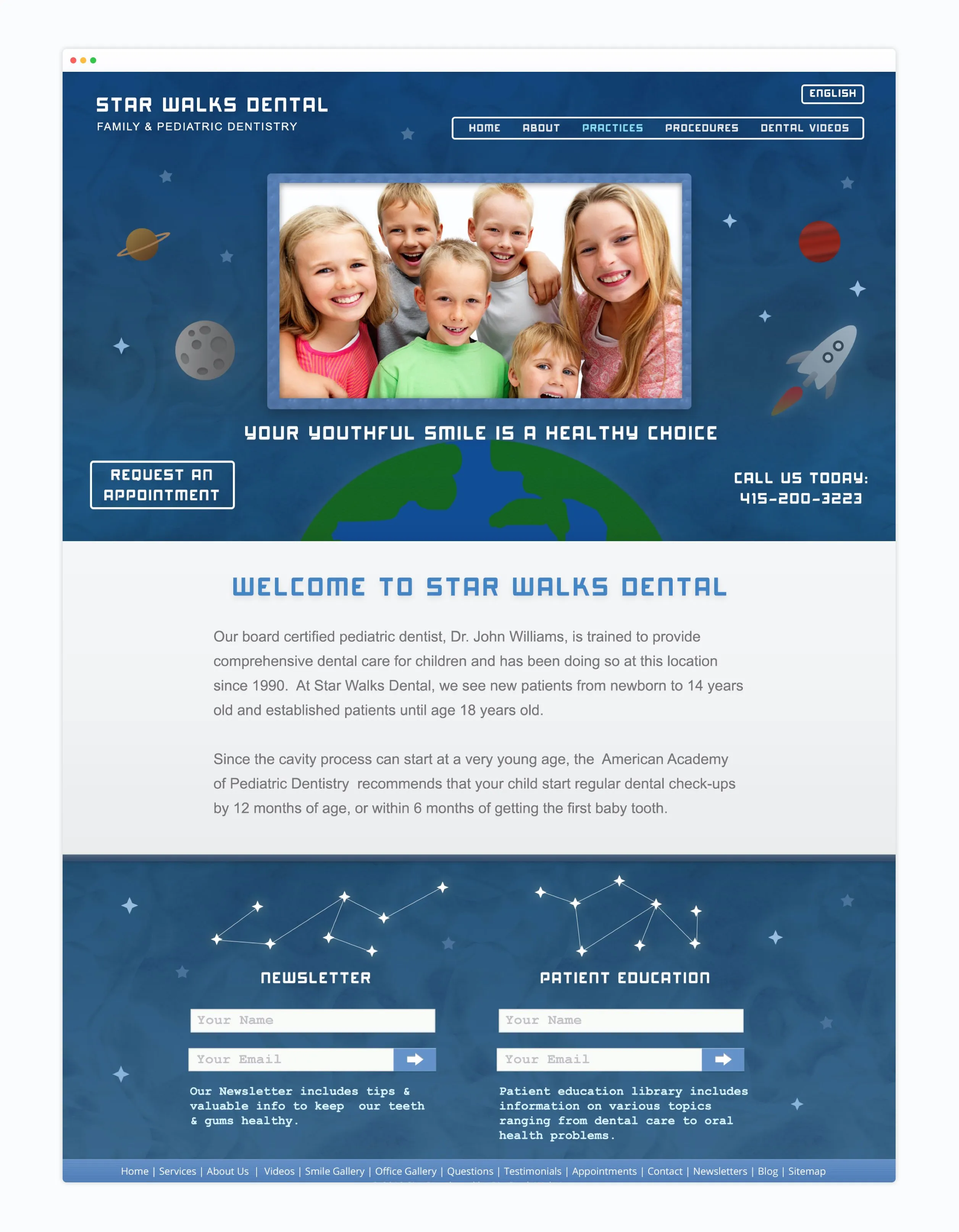
The solution for Star Walks Dental was not to add more design or more content. It was to create clarity.
We translated research insights into a complete digital experience that helps parents understand the clinic, builds trust progressively, and guides them toward booking an appointment without confusion or friction.
Instead of treating UX, UI, branding, and development as separate phases, we designed them as a single connected system.
The first major shift was structural.
Rather than organizing the website around services, we reorganized it around the questions parents need answered before making a decision.
This led to a clearer experience flow:
Each page was designed to answer one of these questions in sequence.
This removed unnecessary decision-making and made the experience more predictable and comfortable.
For paediatric dentistry, emotional tone is not decorative. It directly affects trust.
We designed the visual system to create a sense of calm and familiarity without overwhelming users.
Key decisions included:
The goal was to position the clinic as both welcoming for children and credible for parents.
Star Walks Dental already had a distinctive identity, but it needed to be expressed consistently across the digital experience.
Instead of treating branding as a static layer, we integrated it into every interaction.
The space-inspired theme was used to:
Importantly, the branding was always secondary to clarity. It enhanced understanding rather than competing with it.
Several UX decisions were made specifically to reduce hesitation during the decision-making process.
Information is introduced in layers:
first clarity, then detail, then action.
This prevents overwhelming new visitors while still supporting deeper exploration.
Instead of repeating “Book Appointment” throughout the site, calls to action appear after relevant context is provided.
This ensures users feel informed before being asked to take action.
Navigation was reduced to the essential pathways families actually use:
This reduces cognitive load and helps users find answers faster.
The interface was designed to feel effortless to use across all devices.
Key UI principles included:
Every design choice was made to reduce friction, especially for mobile users who make up a large portion of healthcare search traffic.
The website was built in Webflow to ensure flexibility and long-term maintainability.
The CMS structure allows the clinic to easily manage:
Without requiring technical support.
The build was also structured with scalability in mind, ensuring new pages and content can be added without breaking consistency or design integrity.
Rather than a static website, the final product is a modular system.
This means:
This approach ensures the website remains useful long after launch.
The best healthcare websites do not feel “designed.” They feel structured. When information is clear and predictable, users focus less on the interface and more on making confident decisions.
For Star Walks Dental, success was not defined by visual design alone. The primary goal of the website was to help more families move from initial discovery to booking an appointment with confidence.
In healthcare, conversion is rarely impulsive. It is the result of trust, clarity, and reduced uncertainty over time.
Unlike e-commerce or lead generation for simple services, dental appointments involve higher emotional and cognitive consideration.
Parents typically do not book immediately. Instead, they:
The website needed to support this extended decision cycle.
Instead of using urgency-based tactics, we focused on trust accumulation.
This meant prioritizing:
By the time a parent reaches a call to action, they already feel informed and confident.
A key conversion principle was reducing unnecessary steps between intent and action.
We focused on:
Every additional step in the journey increases drop-off risk, especially on mobile devices where most local searches begin.
Rather than placing identical “Book Appointment” buttons throughout the website, we designed contextual calls to action that appear after meaningful information is provided.
For example:
This ensures that action is a natural continuation of understanding, not an interruption.
Most conversion barriers in healthcare are not technical. They are psychological.
Common uncertainties include:
We addressed these concerns directly through structure and content, rather than relying on persuasion.
When uncertainty decreases, confidence increases, and conversion becomes more likely.
A significant portion of healthcare traffic occurs on mobile devices, often during moments of immediate need or quick research.
We optimized the experience for:
This ensures the conversion path remains consistent across all devices.
Rather than treating conversion as a separate layer added at the end of the design process, it was embedded into the entire experience.
When users:
Conversion becomes a natural outcome of the experience.
Design insight
In healthcare, you do not increase conversions by pushing harder. You increase conversions by reducing uncertainty.

The Star Walks Dental website now provides a clearer, more structured experience for families exploring the clinic for the first time.
Rather than overwhelming visitors with information or forcing early decisions, the new experience allows parents to understand the clinic at their own pace while building confidence through clarity and structure.
The redesigned website creates a smoother path from discovery to decision.
Parents can now:
This shift reduces hesitation during the decision-making process and supports more informed enquiries.
One of the most noticeable improvements is how information is organized.
Instead of navigating a service-led structure, families now experience a journey that reflects their natural thought process. This makes it easier to find answers and reduces the effort required to evaluate the clinic.
Beyond immediate usability improvements, the website now provides a long-term foundation for growth.
With a flexible Webflow CMS and a structured design system, the Star Walks Dental team can:
This ensures the website remains useful and relevant over time without requiring a full redesign.
The new website better reflects the clinic’s personality and positioning.
The space-inspired identity is now consistently applied across the entire experience, helping create a more memorable and distinctive brand presence in a competitive local market.
While performance metrics vary over time and depend on marketing activity, the redesigned website provides Star Walks Dental with:
A successful redesign is not defined by how different it looks, but by how much easier it becomes for people to understand, trust, and take action.

Every healthcare website project reinforces how important clarity and trust are in shaping user decisions. Star Walks Dental was no exception.
Several principles from this project continue to guide how we approach similar work:
Most visitors do not book immediately. They move through a process of understanding, comparison, and reassurance. Designing for that journey is more effective than trying to push for immediate action.
In healthcare, credibility is more important than content volume. If users do not feel confident in the clinic, additional information will not improve conversion.
A clear information hierarchy reduces cognitive load and helps families find answers faster. Simplicity is often more effective than adding more design elements.
A strong identity is valuable, but it must never interfere with usability. In this project, the space-inspired theme was used to support understanding, not distract from it.
The most effective improvement a website can make is not persuasion. It is clarity. When uncertainty decreases, confidence and conversion naturally increase.
The Star Walks Dental website redesign focused on one core objective: helping families feel confident in their decision before booking an appointment.
By combining strategy, UX design, UI design, and a scalable Webflow system, we created an experience that supports both the clinic’s growth and the needs of the families it serves.
This project reflects a simple principle that guides all of our work:
A better website is not one that looks more impressive. It is one that makes decisions easier.
We combine strategy, UX, branding, and SEO to create websites that are designed not just to look good, but to perform. If you are looking to redesign your website or improve your online conversion performance, we would be happy to explore your project.