
Helping The Village Church share the gospel & welcome seekers online
The Village Church is a conversion-focused website designed to guide first-time visitors, reflect the mission, and help people find faith and local community in Thorold, Ontario.

Who this project is for?
This project is a good example for churches that already have a website but want it to attract more seekers of faith, hope, and belonging, and guide them toward meaningful steps like joining a ministry, attending a service, or connecting with the community.
The challenge
Websites are often the first interaction someone has with a church. Like many churches, The Village Church already had a website, but it wasn’t speaking to their target demographics as well as it could.
Their previous site struggled with:
- Low visibility on Google: People searching for a church in Thorold often couldn’t find the website or connect with the church.
- Limited spiritual connection online: Contact forms, emails, and phone calls weren’t fully capturing people’s interest or encouraging action.
- Navigation confusion: Navigation reflected internal Christian terminology rather than speaking the non-Christian's language.
- Mobile usability barriers: The overall experience felt dated and hard to navigate on mobile
Why a website redesign made sense
The church had a clear mission and a strong message. The issue wasn’t the community. It was website structure, searchability, and user experience.
A website redesign allowed us to:
- Keep what already worked
- Create & reorganize content around first-time visitors
- Design clearer pathways to key actions
- Improve usability without overcomplicating the site

Our approach
We approached this project with one guiding principle: Design the website for the person visiting for the first time. Every design decision was made to reduce friction and build trust.
User-first structure
Gentle, conversion-focused UX
Local SEO discoverability
Design that feels human
User-first structure
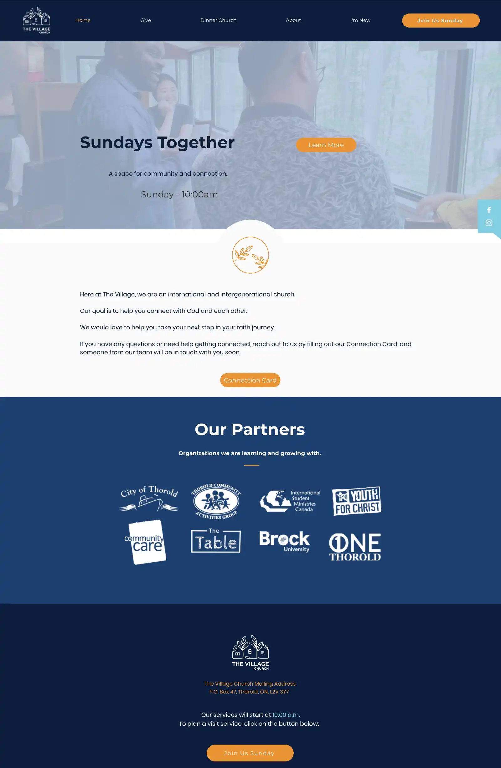
The website was reorganized around the most common visitor questions:
- Who is this church for?
- What will my first visit be like?
- When and where do services happen?
- How do I get connected beyond Sunday?
Clear pathways reduce uncertainty and help visitors feel confident before attending in-person.
Gentle, conversion optimization
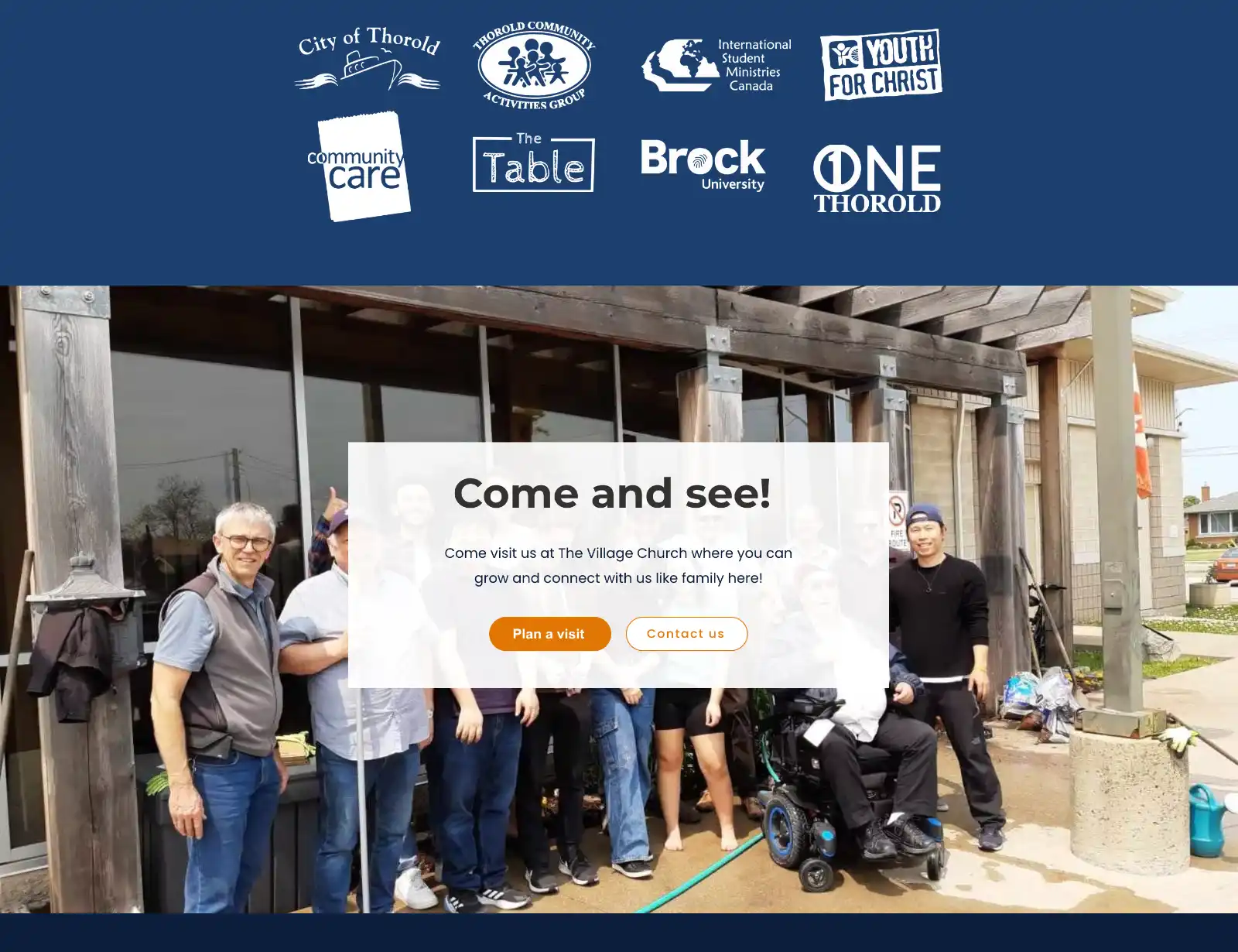
Instead of passive prompts, the site uses clear and Scripture-inspired calls to action:
- Come and see!
- Plan a visit
- Get in touch
These actions are visible, simple, and placed where visitors naturally look.
Local SEO for discoverability
We built sustainable SEO foundations:
- Logical page hierarchy and headings
- Search-friendly page titles and meta descriptions
- Internal linking between key pages
- Mobile-first, fast-loading layouts
This ensures the church is discoverable for searches like “church in Thorold” without over-optimizing.

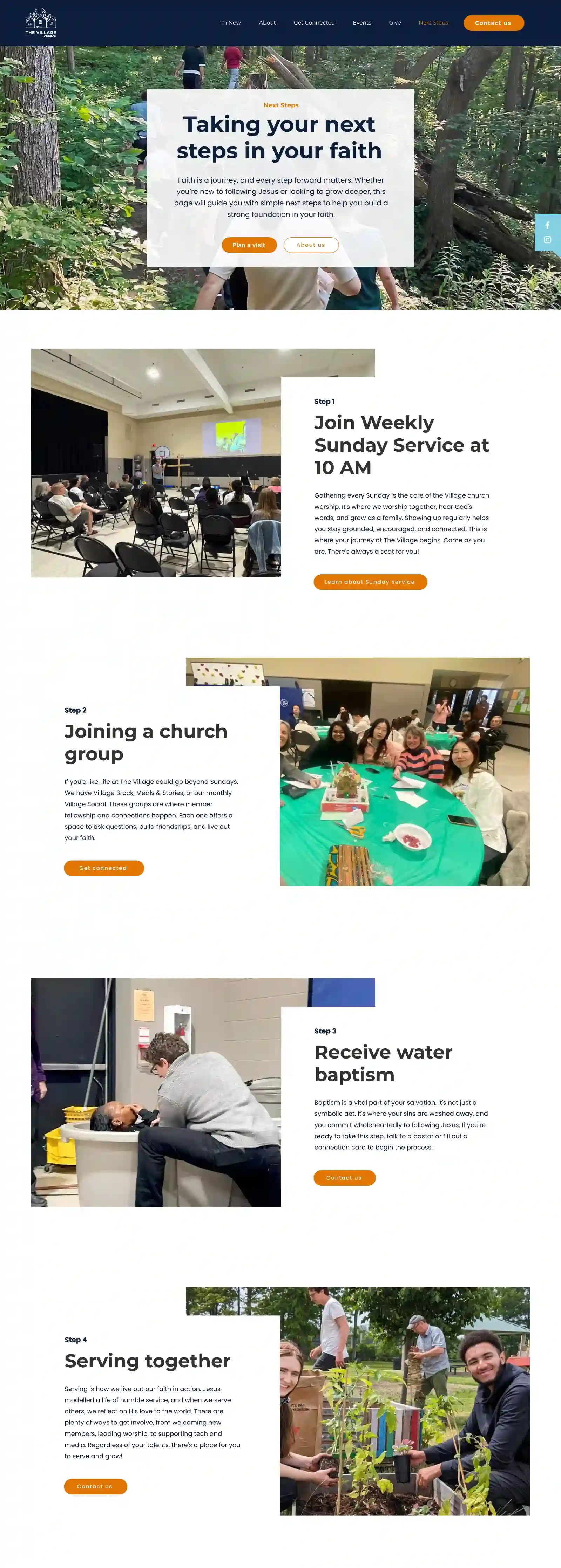
UX design that feels human
The visual design prioritizes warmth and readability, while preserving the existing visual identity:
- Comfortable spacing and accessible typography
- Authentic photography capturing real community life
- Calm, clean aesthetics supporting trust and approachability
The goal was to mirror the in-person experience online.
Key redesign improvements
- Content optimized for conversion, SEO, and GEO
- Clear “Plan your visit” and newcomer-focused calls to action
- Improved typography and spacing for web readability
- Streamlined navigation with fewer decision points
- Better mobile experience across all key pages
Visual highlights
A glimpse at the screens and design elements that reflect The Village Church’s heart: welcoming seekers, showing various ministries, and guiding people to connect.


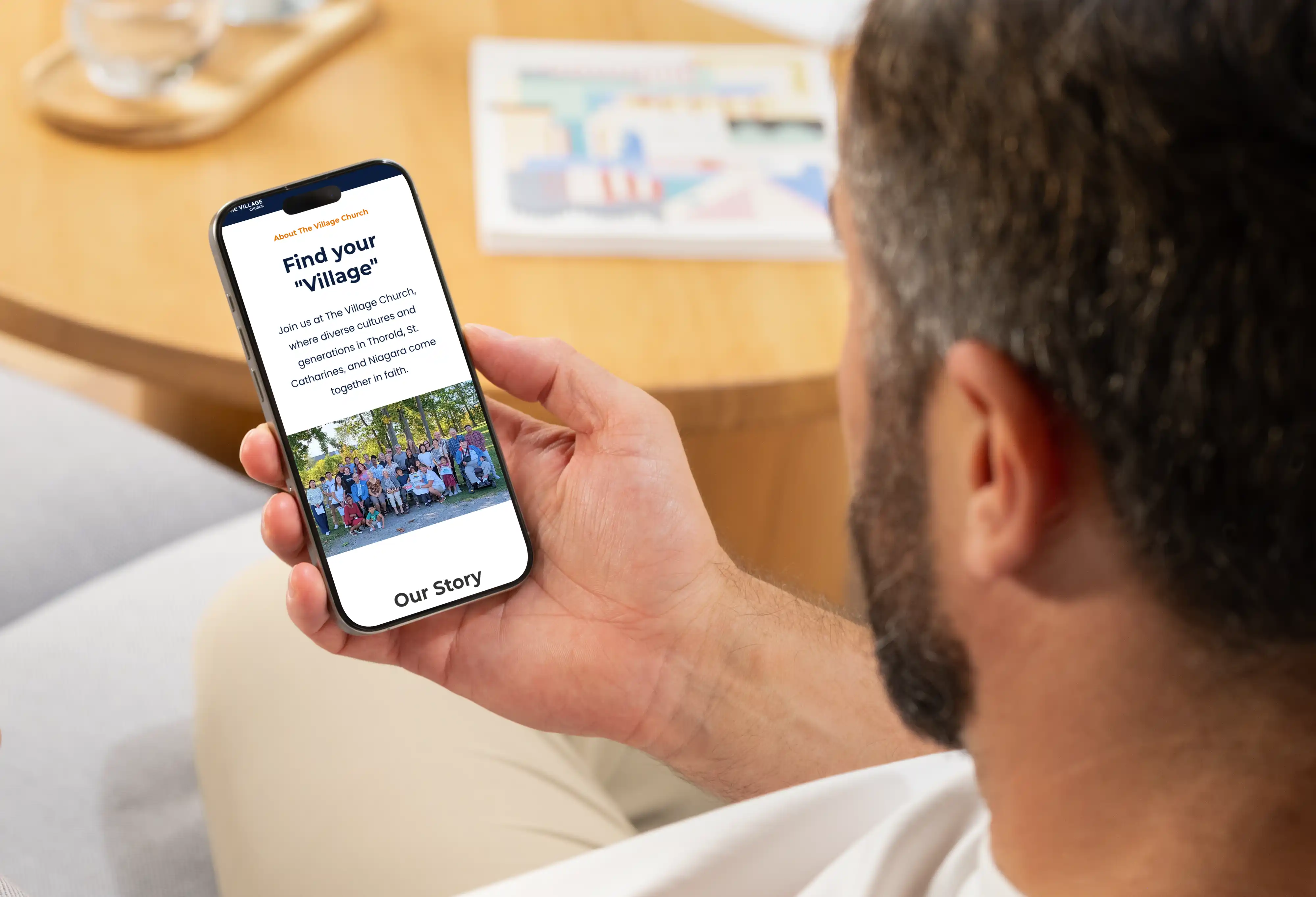
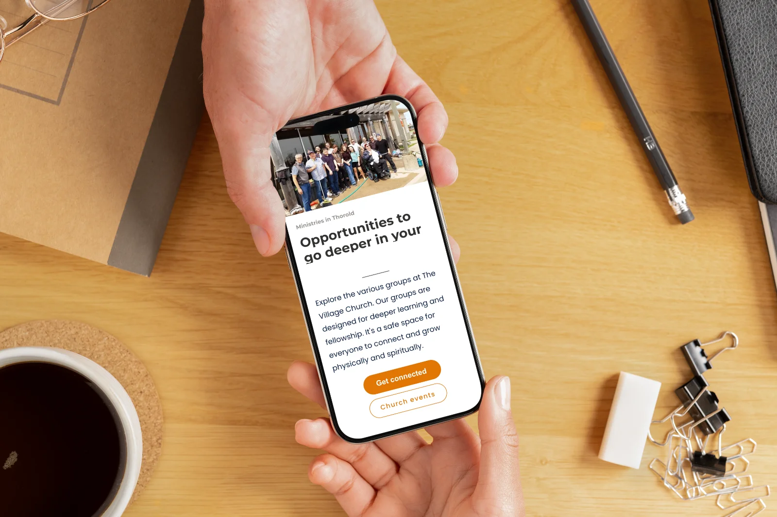
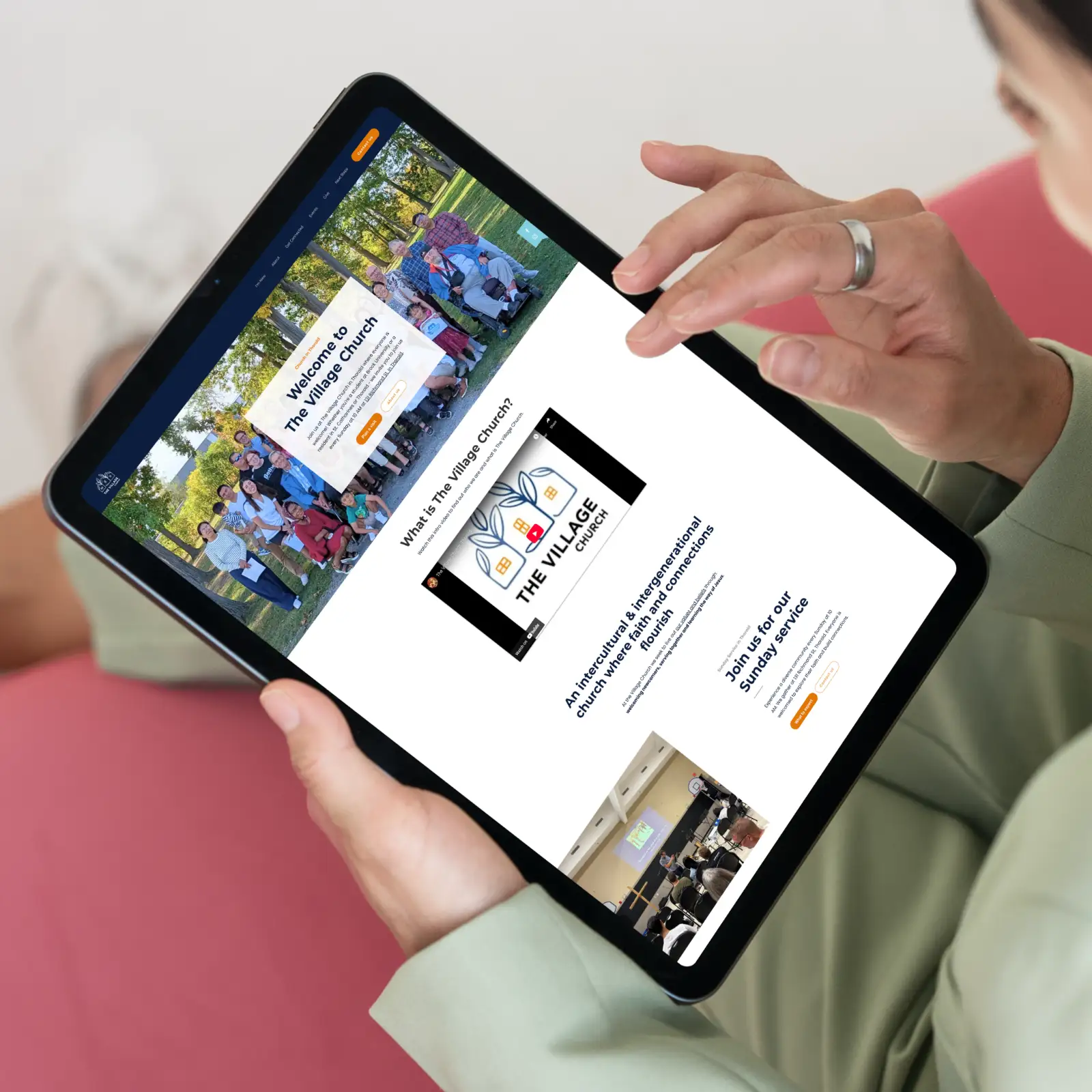
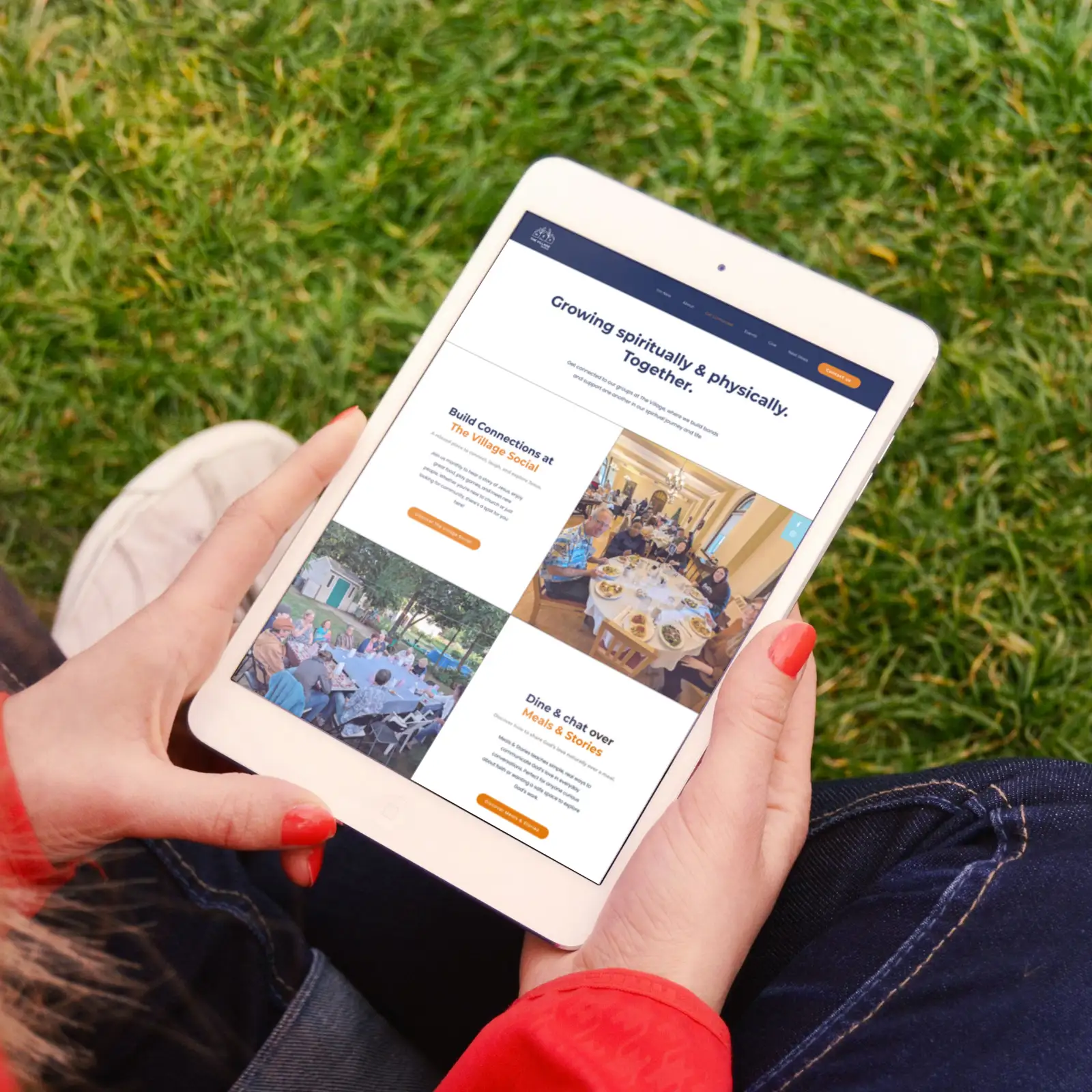
Church website design that speaks to first-time visitors
These results show how the website not only improved online engagement but also amplified the ministry’s reach and welcome to new visitors.
for “church in Thorold,” making the church easier to find when seekers search for a local faith community
in “Plan a visit” and first-time visitor-focused page interactions, helping more people find God and connect with community
in contact inquiries for prayer, ministry involvement, and spiritual guidance
"The newly published website looks awesome! You are doing careful work... This is excellent, thank you. It's been a pleasure working with [FAMGO]"

Helping churches across the world create clear, welcoming websites
If your church website no longer serves effectively in your ministry, a conversion optimized website design can help welcome seekers and guide people toward faith and community.
