
A conversion-focused website for a new supermarket in London, Ontario
JH Supermarket was preparing to enter a market with established grocery chains but with no online presence yet. The store needed a website that introduced it, made the weekly flyer easy to find, and gave local shoppers a way to get in touch before opening day.
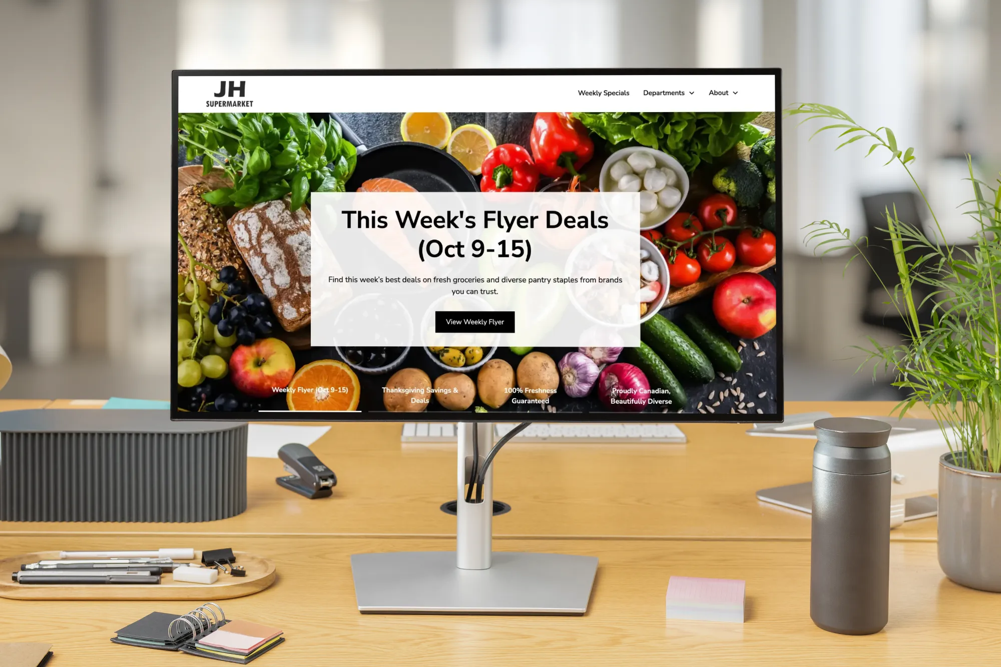
We launched a coming soon page in January 2026, then built the full Webflow site around the weekly flyer, the store's departments and its identity as an independent Canadian supermarket. Before opening, the site already drew 250+ inquiries and newsletter signups. FAMGO designs grocery store websites built around conversion, local SEO, AEO and GEO. For JH, that meant one clear goal: get shoppers to the weekly flyer.
What JH Supermarket needed
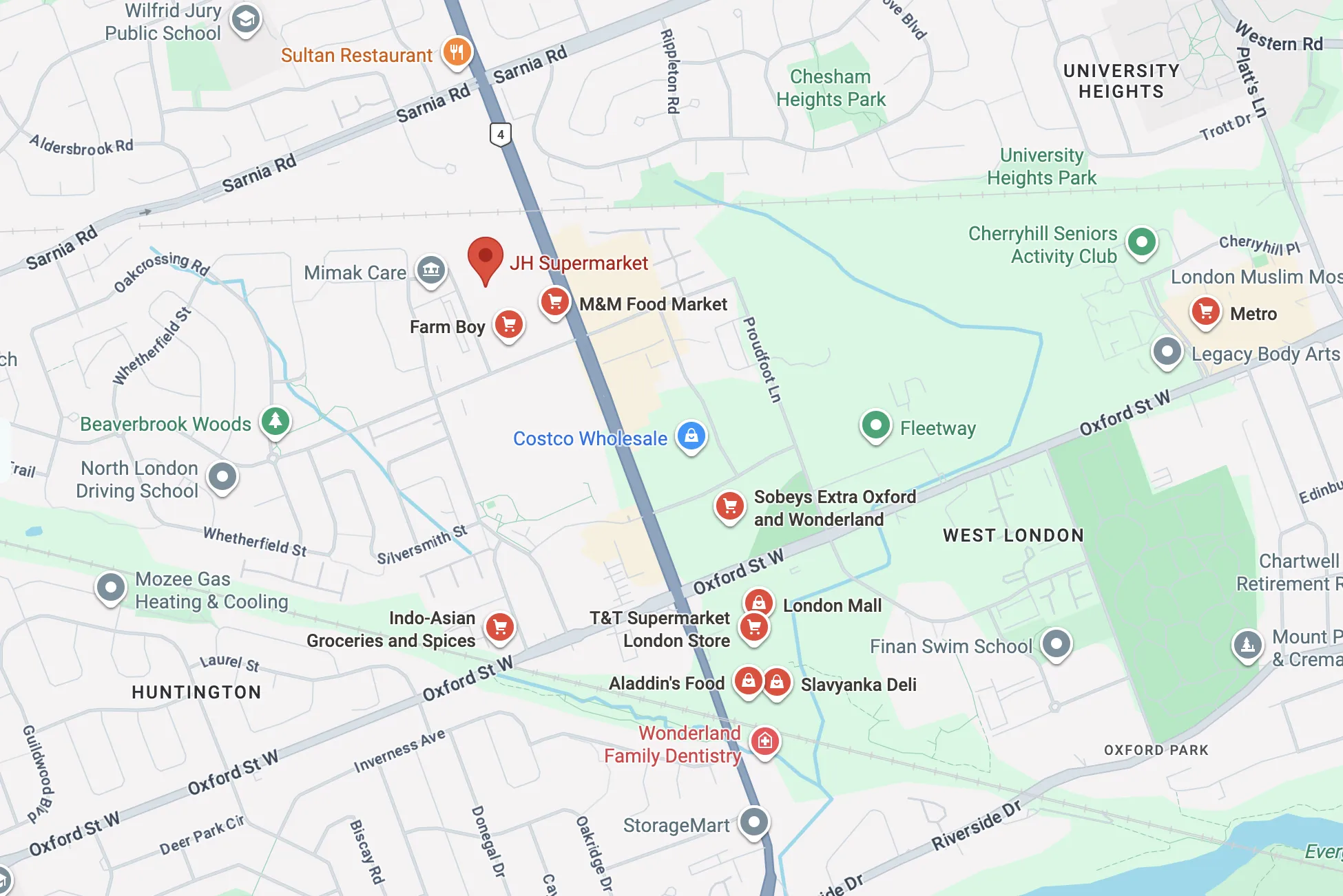
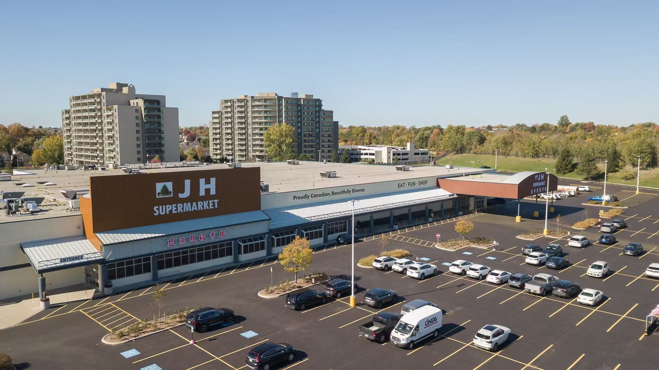
JH Supermarket is an independent supermarket at 820 Blythwood Rd in London, Ontario. It was entering a market with established chains, so the website had three jobs, in this order: get shoppers to the weekly flyer, introduce JH as an independent store that is new in town, and make it clear that the store is Canadian.
The flyer was the site's highest priority. The goal is flyer views that bring shoppers into the store, so every other decision follows from it.
The owners were also clear about what the store should not be. Not Western-centric, and not Eastern-centric. They wanted a grocery store that truly reflects the diverse flavours of Canada, and a website that says so at first glance.
Who the site had to convince
The audience is college students and families who live in London, Ontario.
For a store that is both independent and new, the site had to introduce JH quickly, earn trust, and make the flyer easy to find for both groups.

Our design process
We guided JH Supermarket through FAMGO's human-centred design process, covering brand details, website design, UX, local SEO, AEO and GEO, and conversion rate optimization. Every step served three conversion goals: weekly flyer views first, newsletter signups second, and directions or contact third.
Brand identity & positioning
Website design & UX
Conversion-focused content
Local SEO, AEO & GEO targeting
Search performance tracking
Start with the neighbourhood, not a template
The project began in person, with discovery sessions at a café restaurant and a coffee shop, where the owners described the store they wanted.
We then reviewed how other grocery stores present themselves online, from Ontario chains to ethnic supermarkets.
Two references came from outside the market: Trader Joe's, which doesn't offer online shopping and leans on its flyer, the same role the flyer plays for JH, and Erewhon, which we studied for how it handles a black logo.
Brand details that feel like a neighbourhood store
We kerned the logo. In the original logo, the J and H sat too far apart.
For type we chose Nunito Sans. It is a modern sans-serif, but its rounded forms keep it friendly, which is the neighbourhood impression a new independent store needs. Because the logo is black and white, the colour on the site comes from the grocery photography itself.
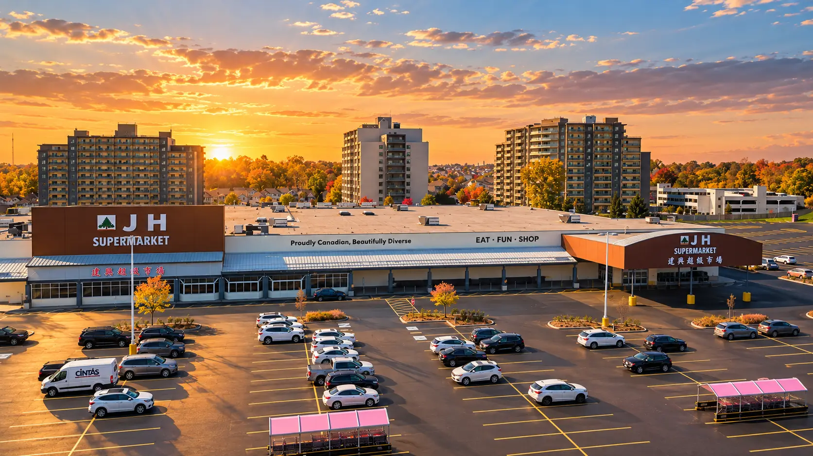
We also wrote the store's tagline: “Proudly Canadian, Beautifully Diverse.” It says the two things the owners wanted the site to say, in one line.
“Really like this: Proudly Canadian, Beautifully Diverse. This is a billion dollars idea (slogan)!”
Put the flyer first
After discovery, we worked through a sitemap and wireframes before any visual design, then built the site in Webflow.
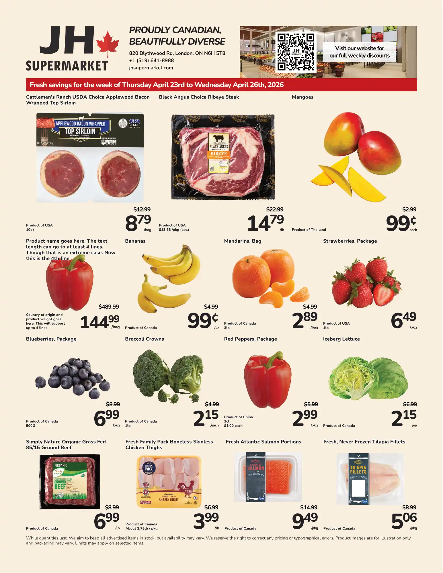
The flyer shaped the structure. “Weekly Specials” is the first item in the main menu, and a “View Weekly Flyer” button appears on key pages, so the thing shoppers come for is never more than one click away.
We also designed the weekly flyer template. JH's team prepares each week's flyer, and FAMGO optimizes it and publishes it to the website, so the weekly update is a routine, not a rebuild.

A page for every department
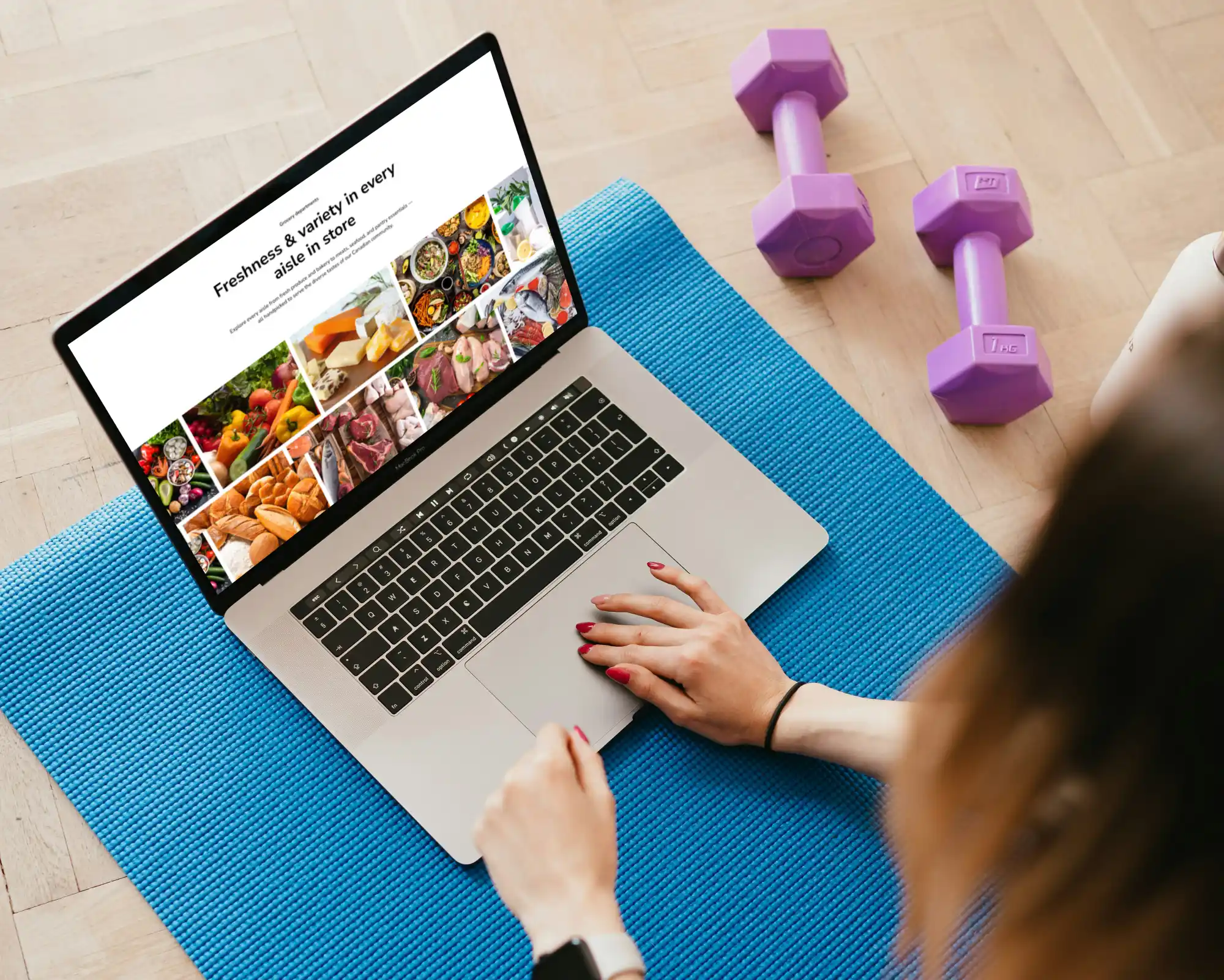
The site has a page for each of JH's eleven grocery departments: Produce; Meat; Seafood; Dairy, Eggs & Frozen; Breads & Bakery; Cheese & Deli; Hot Foods; Pantry & Packaged; Health & Lifestyle; Household & General Merchandise; and Floral.
The aim was practical. Shoppers can go straight to the part of the store they care about, and each department has room to tell its own story. It also gives search engines and AI assistants more clearly organized content to work with.
Merry Kids Playground, next door
Next door to the store is Merry Kids Playground, by the same owners. The site has a page that introduces it and links to its own website. FAMGO also designed and built the Merry Kids website.
Make the next step obvious
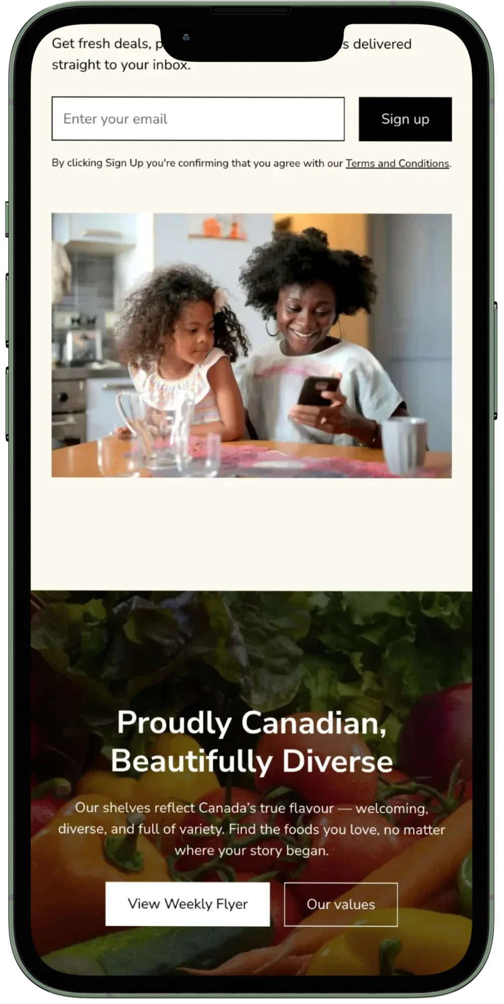
The main actions are the flyer, the store's location and the newsletter.
The address comes with a “Get Directions” link, and a newsletter signup (“Fresh savings delivered to your inbox”) runs across the site.
The contact form asks only for a name, email and message. We protected the form with Cloudflare Turnstile. Our records show more than 45 bot and spam submissions before we switched from reCAPTCHA to Turnstile at the end of May.
Built to be found, and easy to interpret
Keyword research focused on two searches: “grocery store London Ontario” and “supermarket London Ontario.” Each department page has its own title and description aimed at a local search, such as “Shop Fresh Produce in London” and “Shop Dairy, Eggs & Frozen in London, ON.” The Departments page is titled “London Grocery Store Departments.”
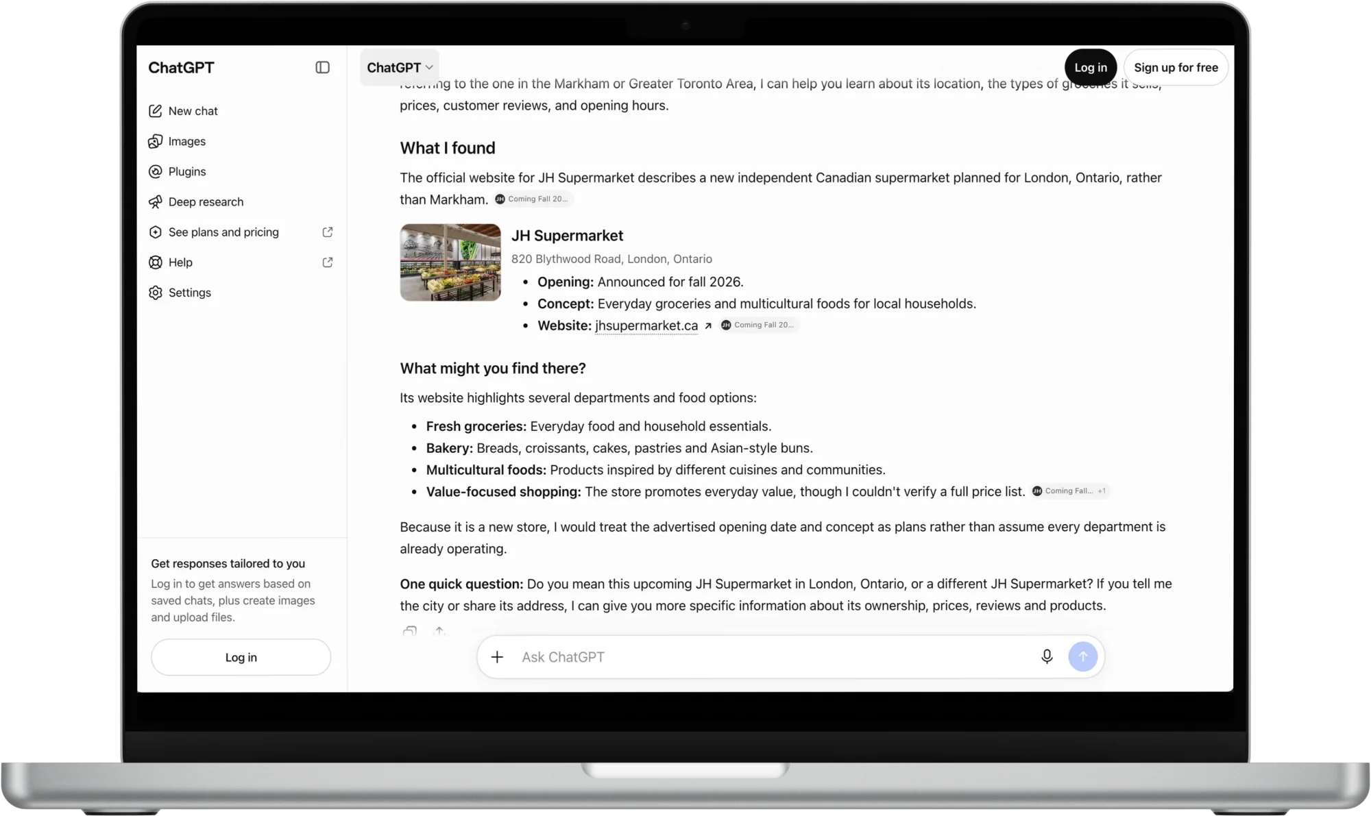
For AEO and GEO, we added structured data (breadcrumbs, store details and FAQ markup) and wrote the FAQ in short, plain-language answers. The aim is to make the store's information clear and easy for search systems to interpret. We also advised the owner to set up a Google Business Profile in January, so the store could appear on Google Maps before it opened.
A coming soon page, on purpose
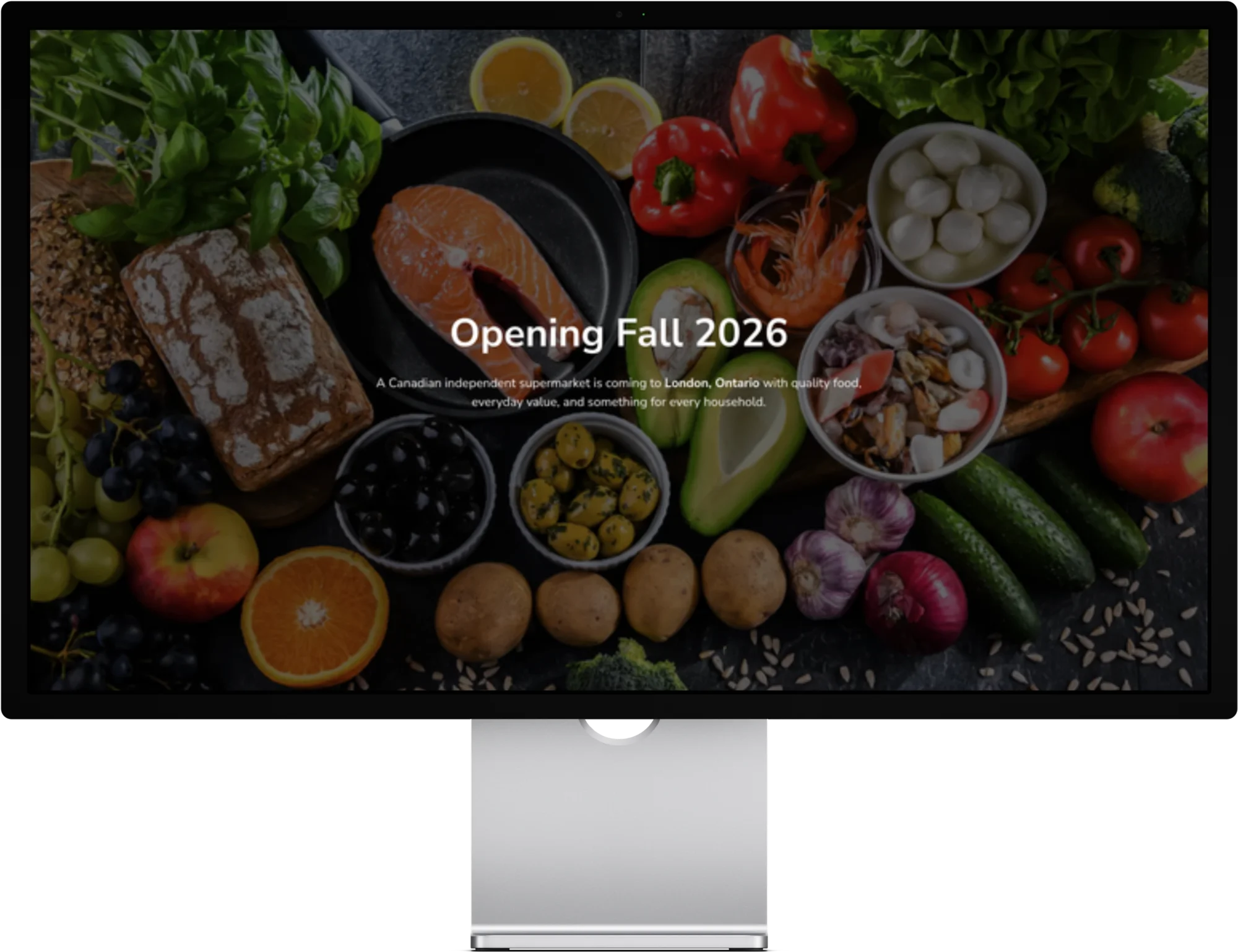
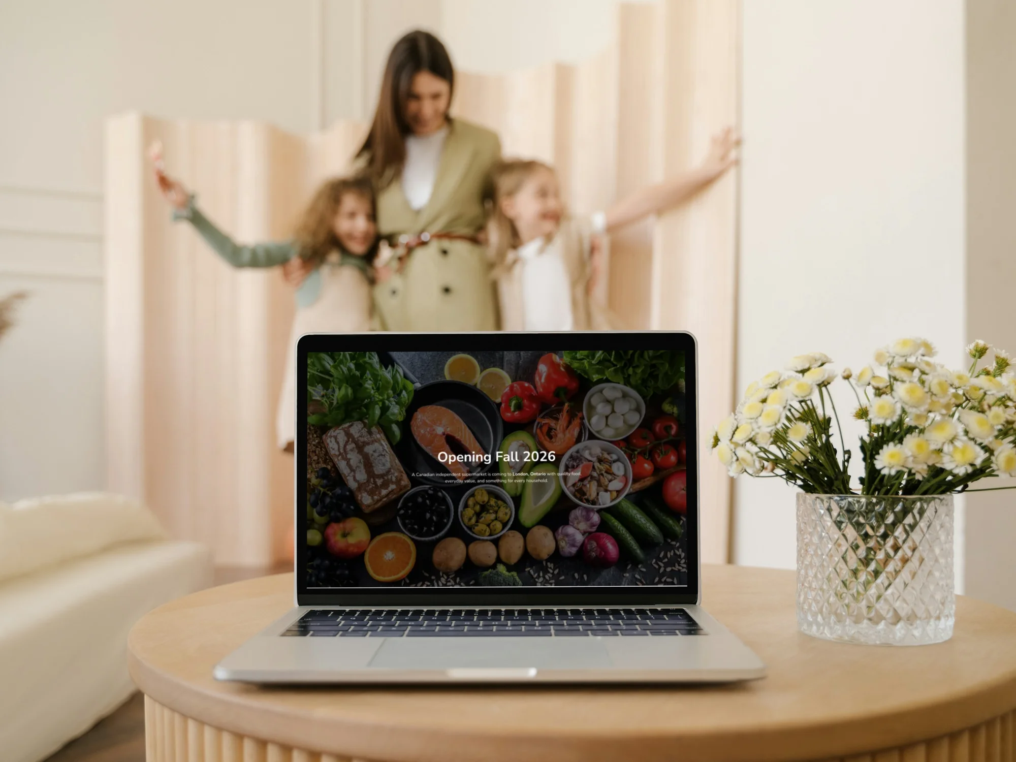
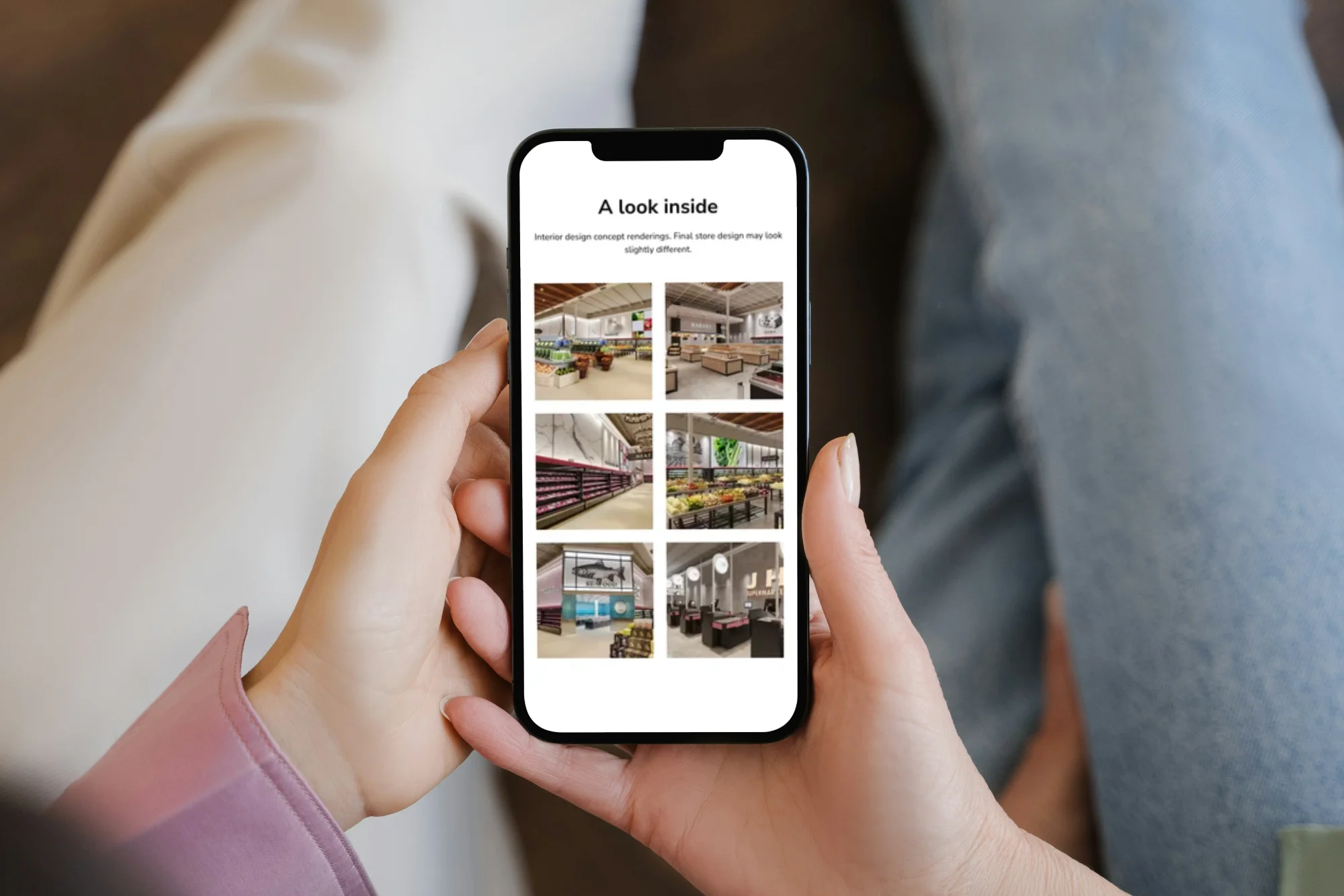
Rather than waiting for opening day, we launched a coming soon page in January 2026, to build anticipation. It had the address, concept renderings of the interior, an opening-season message, a newsletter signup and a simple contact form.
The coming soon page told London a new supermarket was on the way and gave neighbours a way to contact JH Supermarket and sign up for updates before the store opened. Across the pre-opening period, the site collected more than 250 inquiries and newsletter signups.
On October 23, 2026, the full site replaced it, in time for the store's grand opening.
Results
The full site launched on October 23, 2026, the day of the store's grand opening. Before that, jhsupermarket.ca's coming soon page earned 6.47K impressions and 1.82K clicks in Google Search from October 13 to 18, at an average position of 2.5. Most of that came from people searching for the store by name, so we read it as strong early interest, not proof of ranking for local searches. We don't claim sales results yet, and this section will grow as the data does. See our work
250+
inquiries and newsletter signups before opening
41
contact messages in September, the busiest month before opening
1.82K
Google Search clicks, October 13 to 18, 2026
Who the project is for
Case studies are only useful if they map to your situation. This one is worth your time if any of these sound like you.
You're opening a store and nobody knows you yet.
A coming soon page and a clear, fast site can start building awareness months before the doors open. See our web design service
You're independent and up against chains.
A chain has a name people recognize. An independent has a story. Clear department pages, practical FAQs and an easy-to-find flyer help local shoppers understand what the store offers, and give local searches relevant content to match. See our SEO, AEO & GEO services
Your customers come from many cultures.
JH's brief ruled out a store that felt Western-centric or Eastern-centric. If your customers come from many backgrounds, design decisions change, from the tagline to the typeface.
You need a site that stays current.
A weekly flyer means weekly changes. We set up a repeatable workflow: JH's team prepares each week's flyer, and FAMGO optimizes and publishes it online.
Visual highlights
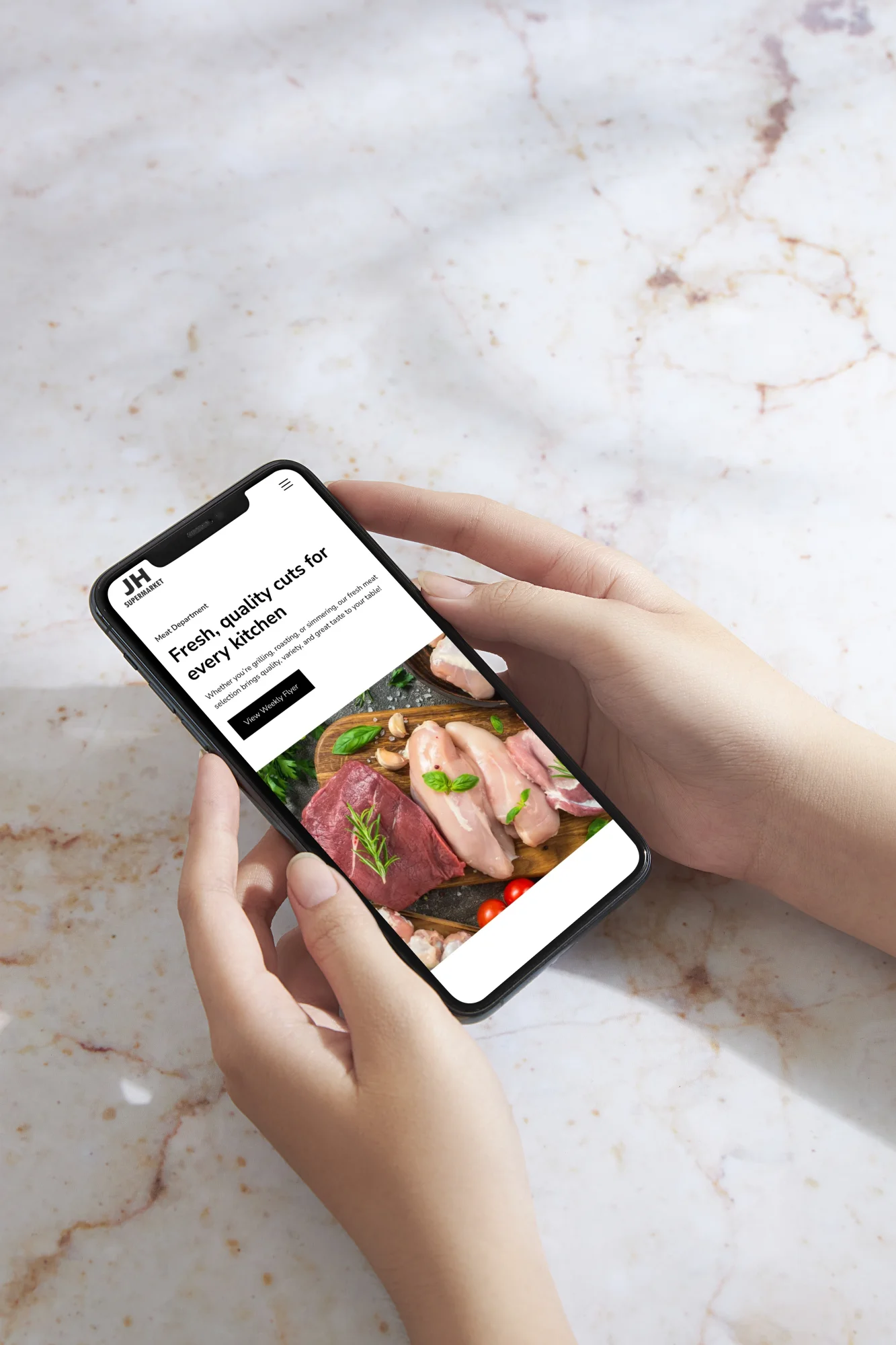
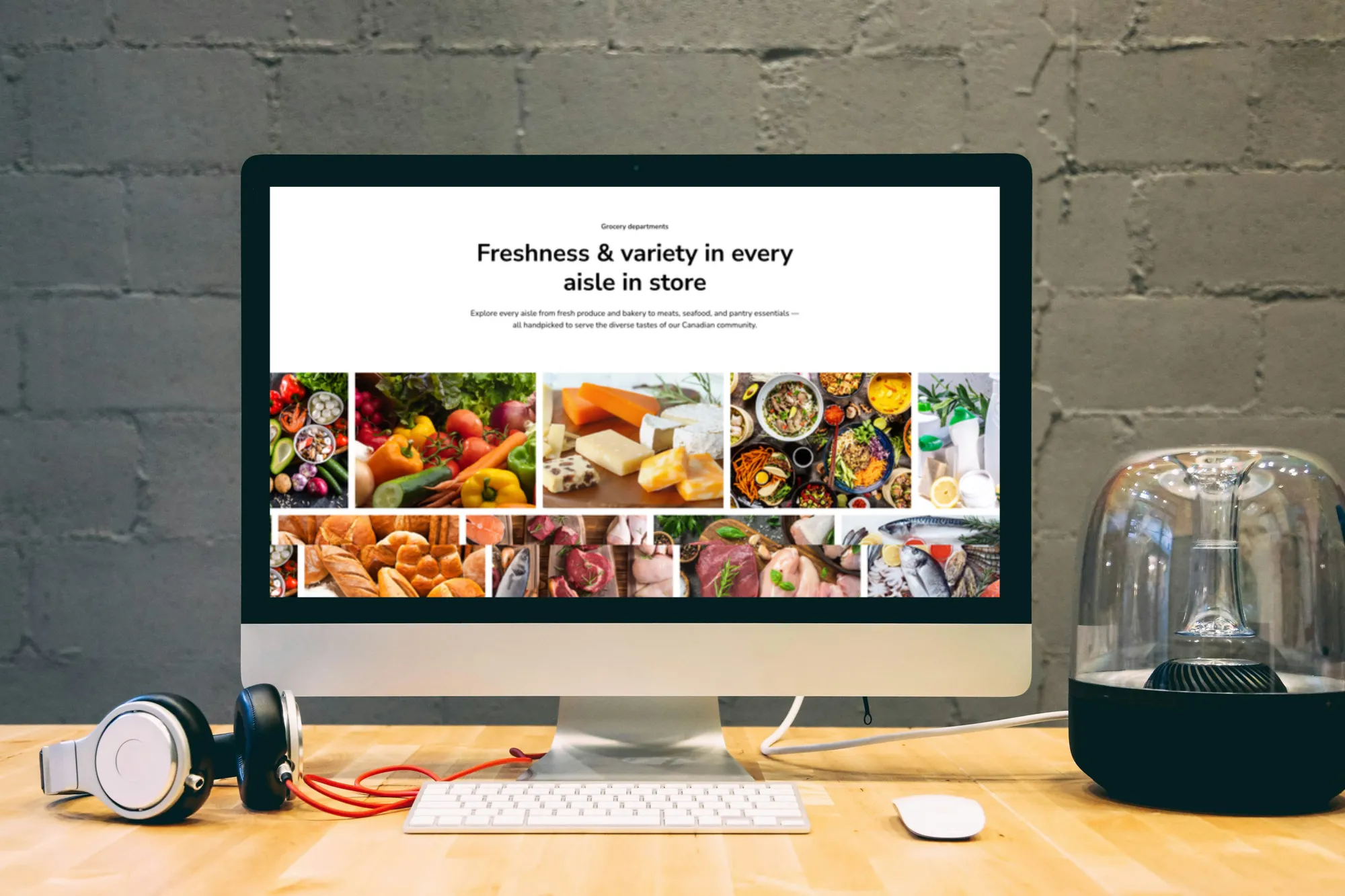
A visual walkthrough of the JH Supermarket website, showing the homepage, department pages, weekly flyer page and mobile layouts.


The things you're probably
already wondering.
If you’re considering a conversion-focused website, you probably have questions about cost, timelines, and what the process looks like. Here are some of the most common questions we hear from business owners.
A Webflow website for a new independent supermarket in London, Ontario, with a weekly flyer page, eleven grocery department pages, a newsletter signup, a FAQ and a contact form. We also refined the logo, wrote the tagline and designed the weekly flyer template.
Each page lets a department tell its own story and helps shoppers go straight to what they need. The department pages also give search engines and AI assistants clearly organized content about what the store carries.
No. Merry Kids Playground is a separate business next door. The JH Supermarket site has a page introducing it, with a link to its own website.
It can help. A coming soon page lets the store start collecting questions, email signups and job inquiries months early. JH Supermarket's went live in January 2026, nine months before the store opened, and gave neighbours a place to ask questions long before the doors opened.
The site’s main goal is flyer views that lead to store visits, and the flyer gives shoppers a quick way to check weekly specials. JH’s brief ranked flyer access first, so “Weekly Specials” is the first item in the menu.
Clear page titles, short plain-language answers, consistent business details and structured data make a store’s information easier for search systems to interpret. No approach guarantees rankings or AI mentions. JH’s site uses local page titles, FAQ content with FAQ markup, and breadcrumbs and store details on department pages.
Yes. FAMGO is a Toronto-based web design agency, and we design websites for businesses across Ontario and beyond. JH Supermarket in London, Ontario is one example. We work remotely through video calls and shared design reviews, so your location doesn’t change the process or the quality of the result. Book a free consultation and we’ll talk through your project.
Still have questions?
If you’re unsure which package is right for you or want to talk through your needs, feel free to reach out!
What this means for your business
If you're opening a grocery store or local shop, your website's first job is to introduce you before the doors open and put your weekly flyer one click away. We design grocery store websites, and JH Supermarket shows how we approach one.


